What is an eCommerce Checkout Flow?
An eCommerce checkout flow is the journey a customer takes from deciding to buy something to successfully completing the payment.
Think about what happens after someone clicks “Buy Now” or “Proceed to Checkout.” They may need to enter their contact details, add a delivery address, choose a shipping option, apply a coupon, select a payment method, make the payment, and finally receive an order confirmation.
All of these steps together make up the checkout flow.
Why Checkout Flow Design Matters for eCommerce Businesses
Getting a customer to the checkout page takes effort. They have already discovered the product, compared options, checked the price, and decided that they are interested enough to buy.
At this stage, the checkout should help them finish the purchase, not give them another reason to think twice.
A well-designed checkout flow can make a direct difference to how many customers actually complete their orders. When the steps are clear, the forms are easy to fill, the total cost is visible, and the preferred payment method is available, there is less friction between the customer and the purchase.
The opposite is also true. Even a small inconvenience can become a reason to leave. A customer may abandon the checkout because they are forced to create an account, cannot understand an error message, discover an unexpected charge at the last moment, or have to start over after a payment fails.
For an eCommerce business, this matters because checkout performance affects more than just the customer experience. It can influence:
- Conversion rates: A smoother checkout can help more customers complete purchases.
- Cart abandonment: Fewer unnecessary steps give customers fewer opportunities to drop off.
- Customer trust: Clear prices, familiar payment options, and transparent communication make the checkout feel more reliable.
- Repeat purchases: Customers are more likely to return when buying from you feels quick and hassle-free.
- Revenue: Improving checkout completion can help businesses get more value from the traffic they are already bringing to their website.
The goal, therefore, is not to make checkout as short as possible at any cost. It is to make every step feel necessary, clear, and easy to complete.
How to Design the Perfect eCommerce Checkout Flow
A good checkout should require as little effort from the customer as possible. Every step should have a clear purpose, and customers should always know what they are paying, what they need to do next, and what happens if something goes wrong.
Here is how to design the flow from cart to confirmation.
1. Keep the Cart Clear and Editable
Before customers enter checkout, give them one last clear view of what they are buying.
- Show the product name, image, quantity, price and order total.
- Let customers change the quantity or remove an item without leaving the cart.
- Show shipping charges, taxes and other fees as early as possible. If the exact amount cannot be calculated yet, provide an estimate.
- Keep the Proceed to Checkout button easy to find.
2. Allow Guest Checkout
Someone who wants to buy a ₹1,000 product should not have to create an account, verify an email and remember another password before they can pay.
Keep Guest Checkout clearly visible and allow customers to create an account after the purchase if they want to.
This is more than a convenience. Baymard's latest checkout research found forced account creation to be a significant reason shoppers leave checkout.
Every extra field gives the customer one more thing to fill in, check or potentially get wrong.
If you do not need someone's date of birth, second phone number or company name to fulfil the order, do not ask for it.
A few simple practices help:
- Mark optional fields clearly.
- Use browser autofill wherever possible.
- Keep billing and shipping addresses the same by default, with an option to change them.
- Use the right keyboard on mobile for phone numbers, PIN codes and other numeric fields.
4. Simplify Address Entry
Typing a full address on a phone can quickly become frustrating.
Use address autocomplete wherever possible so customers can select an address rather than typing every line manually. Once entered, let them review and edit it easily.
5. Show Delivery Options and Final Costs Upfront
By the time customers reach payment, there should be no surprises about what the order will cost.
Clearly show:
- Product total
- Discounts
- Shipping charges
- Taxes or additional fees, where applicable
- Expected delivery date
- Final amount payable
If there are multiple delivery options, show the price and expected delivery time for each so the customer can make the choice easily.
6. Keep Discounts and Offers Simple
Offers are meant to encourage purchases, but they can also distract customers when used badly.
For example, a large empty “Enter Coupon Code” box can make customers wonder if they are missing a better deal and leave the checkout to search for one.
If a discount is already available to the customer, apply it automatically where possible. Otherwise, keep the coupon field behind a simple “Have a coupon code?” link instead of making it a major part of the checkout.
7. Offer Relevant Payment Methods
Do not make customers change how they normally pay just because they reached your checkout.
Depending on your customers and market, this could include:
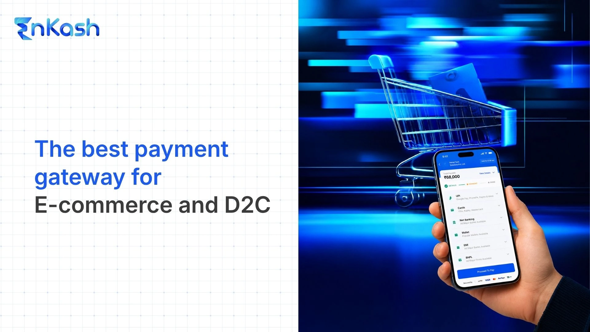
- UPI
- Credit and debit cards
- Net banking
- Wallets
- EMI or Pay Later options
There is no need to show every payment method available in the market. Focus on the methods your customers actually use and make the popular ones easy to find. Payment preferences can vary considerably across markets, which makes a one-size-fits-all checkout less effective.
8. Make the Payment Step Fast and Reliable
A checkout can look perfectly designed and still lose the customer if the payment experience does not work properly.
Once the customer clicks Pay, avoid unnecessary screens, confusing redirects or long periods where nothing appears to be happening.
The checkout should clearly communicate whether the payment is:
Processing → Successful → Failed
Customers should never be left wondering whether money has been deducted or whether they need to pay again.
9. Design for Payment Failures and Retries
Not every payment will succeed on the first attempt, so failure should be treated as part of the checkout flow rather than an exception to it.
When a payment fails:
- Explain what happened in simple language where the reason is known.
- Let the customer retry without entering all their information again.
- Allow them to switch to another payment method.
- Keep their cart, address and order details intact.
- If a payment option is experiencing downtime, guide the customer towards an available alternative instead of repeatedly sending them through a payment method likely to fail.
10. Make Order Confirmation Clear
Do not make customers guess whether their order has actually gone through.
Once payment succeeds, immediately show a clear confirmation page with information such as:
- Order confirmed
- Order or reference number
- Amount paid
- Products ordered
- Delivery address
- Expected delivery date
- Order tracking details, where available
Also send the confirmation through email, SMS or another channel used by your business.
The confirmation page is also a better place for secondary actions such as creating an account, joining a loyalty program or exploring related products. Keep these out of the main checkout so completing the purchase remains the priority.
One-Page vs Multi-Step Checkout: Which Is Better?
There is no single checkout format that works best for every eCommerce business. What matters more is how easy the checkout feels to complete.
One-Page Checkout
A one-page checkout puts customer details, shipping information, payment options, and the order summary on a single page.
It can work well when:
- The checkout requires only a few details.
- Most customers shop on mobile.
- Products do not need complicated shipping or configuration.
- Returning customers already have information saved.
The main advantage is that customers can see and complete everything without moving through several pages. However, if too many fields and options are packed into one screen, the page can quickly start feeling overwhelming.
Multi-Step Checkout
A multi-step checkout divides the process into smaller stages, such as:
Contact Details → Delivery → Payment → Confirmation
This can be useful when the purchase requires more information or when customers need to make several decisions before paying.
If you use this format:
- Keep the number of steps reasonable.
- Show customers where they are in the process.
- Let them go back and edit previous information.
- Do not ask for the same information twice.
So, Which Should You Choose?
| Factor | One-Page Checkout | Multi-Step Checkout |
|---|
| Best for | Simple purchases | More complex purchases |
| Customer effort | Everything on one screen | Information split into smaller steps |
| Main advantage | Faster and more direct | Easier to organize and follow |
| Main risk | Can feel crowded | Can feel long if there are too many steps |
| Works well when | Few fields are required | More details or choices are needed |
How to Optimize the Checkout Flow for Mobile Users
A checkout that works well on desktop may still feel difficult on a phone. Customers have a smaller screen, a touch keyboard, and less patience for long forms or tiny buttons.
This matters because mobile now accounts for a large share of eCommerce traffic, yet mobile shoppers still tend to abandon checkout more often than desktop users. Shopify cites mobile cart abandonment of 81.72% in April 2026.
To make mobile checkout easier:
- Use large, easy-to-tap buttons: Customers should not have to zoom in or carefully aim at small links.
- Keep forms short: Ask only for information needed to complete the order.
- Use the right mobile keyboard: Numeric fields such as phone numbers, PIN codes and card details should automatically open a numeric keypad.
- Enable autofill and address suggestions: This reduces how much customers have to type manually.
- Keep the main CTA visible: Buttons such as Continue or Pay Now should be easy to find without excessive scrolling.
- Make error messages clear: Show the error next to the field that needs fixing rather than making customers search for the problem.
- Avoid unnecessary redirects: Moving customers between multiple pages or apps can make the payment experience feel broken or uncertain.
- Test the complete flow on real phones: Check forms, keyboards, payment options, OTP flows and confirmation screens across different screen sizes.
A checkout may look smooth, but the real test is whether customers are actually completing it. Instead of looking only at overall sales, track what happens at each stage of the checkout.
Here are the key metrics to watch:
| Metric | What It Tells You |
|---|
| Checkout completion rate | How many customers who start checkout successfully place an order |
| Cart abandonment rate | How many customers add products to their cart but leave without buying |
| Drop-off by checkout step | Where customers leave: address, delivery, payment or another stage |
| Payment success rate | How many attempted payments are completed successfully |
| Payment method performance | Whether UPI, cards, net banking or other methods are seeing unusually high failures |
Looking at these metrics together is more useful than looking at one number in isolation.
For example, if many customers reach the payment page but do not complete their order, the issue may not be with the cart or form design at all. It could be a payment failure, slow processing or a problem with a particular payment method.
Similarly, if customers consistently leave at the address stage, simplifying the form or adding address autocomplete may be worth testing.
Frequently Asked Questions
What does an eCommerce checkout flow include?
An eCommerce checkout flow includes all the steps a customer goes through after deciding to buy, such as reviewing the cart, entering contact and delivery details, selecting a payment method, completing the payment, and receiving an order confirmation.
What makes a good eCommerce checkout experience?
A good checkout experience is simple, clear, and easy to complete. Customers should know what they are paying, what information is required, which payment options are available, and what to do if something goes wrong.
How many steps should an eCommerce checkout have?
There is no fixed number of steps that works for every business. A simple purchase may work well with a one-page checkout, while more complex orders may need multiple steps. The focus should be on reducing unnecessary effort rather than simply reducing the number of pages.
Why do customers leave during checkout?
Customers may leave because of unexpected charges, forced account creation, long forms, limited payment options, slow pages, unclear errors, or payment failures. Even small points of friction can cause drop-offs at this stage.
Is one-page checkout better than multi-step checkout?
Not always. One-page checkout can be faster for simple purchases, while multi-step checkout can make complex purchases easier to follow. The better option depends on how much information and how many decisions are required.
How can businesses reduce checkout abandonment?
Businesses can reduce checkout abandonment by offering guest checkout, keeping forms short, showing total costs early, making mobile checkout easy, supporting relevant payment methods, and allowing customers to recover smoothly from payment failures.
How do you know if your checkout flow needs improvement?
Look at metrics such as checkout completion rate, cart abandonment, step-wise drop-offs, payment success rate, and payment failures by method. If customers consistently leave at the same stage, that is usually a sign that part of the checkout needs attention.