Every step of a digital transaction matters, but the payment stage carries the most weight. If the experience feels confusing, slow, or untrustworthy, users abandon the process, no matter how good the product is. The design of the payment gateway directly influences whether a customer completes a purchase or walks away.
A strong user interface combined with a smooth user experience improves more than just usability. It shapes how people perceive the business. Clean layouts, fast-loading screens, and visible security details help build trust. Together, these elements define how users feel during the final moments of their checkout experience.
When done well, payment design removes friction. It supports faster decision-making and makes users feel in control. When it fails, the result is clear: fewer conversions, more support tickets, and lost revenue.
This blog explores the design principles that improve gateway performance. It highlights how a simplified checkout flow, mobile-friendly layouts, and accessible elements impact outcomes. It also covers how the presentation of payment methods, trust signals, and transparency around costs shapes customer behaviour.
For leaders aiming to strengthen digital performance, improving the payment experience is not a nice-to-have. It is a direct way to protect revenue and strengthen brand confidence.
Streamlining the Checkout Flow
A smooth checkout flow is the foundation of a successful transaction. When users reach the final step, their intent is strong. What matters next is how easy it is to complete the process. The fewer the steps and the cleaner the layout, the better the outcome.
The first step is simplification. A checkout should have only the essential fields. Collecting too much information increases drop-offs. Each screen should focus on one goal at a time, whether it is entering delivery details, choosing a payment method, or confirming the order.
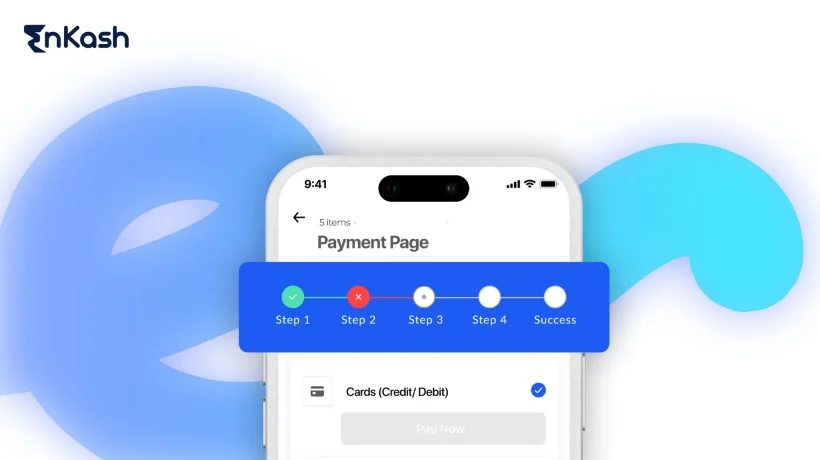
Progress indicators help users understand where they are in the process. A simple visual step guide improves confidence and reduces hesitation. Users are more likely to continue when they know how many steps remain.
Guest Checkout is Essential
Not every user wants to register. Forcing account creation causes friction. Guest checkout allows users to complete their purchase without delays. Later, they can choose to register if they find value in doing so.
The design should allow this flexibility. Businesses can still collect important data, but in a way that respects user convenience.
Form Optimisation Enhances Completion Rates
Inline validation reduces errors. When users get immediate feedback, they correct mistakes faster. This prevents failed submissions and keeps them moving forward.
Auto-fill functions speed up form completion, especially on mobile. Fewer taps and less typing help create a positive checkout experience. The form should support saved addresses and secure card entry where possible.
Group related fields together. Use clear labels and avoid clutter. The simpler it looks, the more likely users are to follow through.
The Role of Call-to-Action Buttons
A clear call to action helps users know what to do next. Words like “Continue to Payment” or “Place Order” remove confusion. The button must stand out visually but also match the overall tone of the page.
CTAs should behave consistently across devices. On smaller screens, they should remain visible and easy to tap. Placement matters. Keep it at the bottom where users expect it.
Each step in the checkout flow should feel natural. The process must reduce resistance and guide users toward completion without distraction.
Read more: Best Payment Gateways for Small Businesses in India
Enhancing Mobile Payment Experiences
Mobile usage continues to grow, and so do mobile transactions. A strong mobile experience is no longer optional. It is a requirement for reaching users who prefer to shop and pay using their phones. The design of a payment gateway must adjust to this behaviour and make mobile interactions as smooth as possible.
1. Responsive Design Is the First Step
Design must adapt to different screen sizes. A layout that works well on a desktop may fail on a smaller device. Buttons must be easy to tap. Fonts must be large enough to read. Forms should open the correct keyboard type for each field.
Simple changes like these make a difference. They reduce drop-offs and help users complete payments without friction. When a form looks cramped or takes too long to load, users give up.
2. Support for Mobile Payment Methods
Users expect flexibility in how they pay. Mobile users prefer fast, familiar tools. Integrating multiple payment methods, such as wallets, direct bank transfers, or UPI, improves completion rates.
When these options are clearly visible, users feel more in control. Highlight the available methods at the start of the checkout flow, not at the end. This reduces surprises and builds trust early in the journey.
3. Performance Must Be Fast and Stable
Speed is part of the experience. Long load times increase abandonment. Mobile users have limited patience, especially when using mobile data.
Optimising scripts, compressing images, and using lightweight code help improve performance. Lazy loading can be used for non-essential elements, but never for forms or payment buttons. Keep the critical steps responsive at all times.
4. Build Trust Through Security Indicators
People hesitate when they sense risk. Trust cues help remove this doubt. Displaying SSL icons, secure lock symbols, or short notes about encrypted connections builds confidence.
Do not rely on visuals alone. Include short messages that explain how user data is protected. This is especially important for first-time buyers or those using a new payment gateway.
Mobile payment design is about clarity, speed, and trust. These elements work together to give users a sense of control. When done well, they lead to fewer errors, better conversions, and greater satisfaction.
Read more: Common Mistakes to Avoid While Integrating Payment Gateways
Designing an Intuitive User Journey
The user journey through the payment process must feel natural and predictable. When users can move from cart to confirmation without confusion, they are far more likely to complete their purchase. A thoughtful structure reduces drop-offs and increases trust in the system.
1. Navigation Should Guide, Not Distract
Navigation plays a silent but powerful role. Each screen in the checkout flow must lead clearly into the next. Users should not feel the need to backtrack or second-guess their progress.
Step indicators help. When users can see where they are and what is left, they feel more confident. These markers should be placed clearly and use simple labels like “Shipping”, “Payment”, and “Review”.
Avoid distractions. Keep external links, popups, or unrelated content out of the checkout screens. The focus should remain on completing the task at hand.
2. Show the Order Summary Without Disruption
A visible order summary throughout the process adds clarity. Users want to check what they are buying, how much it costs, and what charges have been applied. Keeping this information within reach helps reduce anxiety.
The summary should allow simple edits. If a user changes quantity or removes an item, the system should update immediately without sending them back to the cart. This keeps the flow intact.
3. Handle Errors with Clear Language
Mistakes happen, but they should not end the journey. When users enter the wrong details or miss a field, the message should be specific and helpful. Avoid technical language. Instead of saying “invalid input,” say “Please enter a valid phone number.”
Place error messages close to the issue. Use visual cues to draw attention. These steps help users correct problems without losing patience.
4. Accessibility Must Be Built In
Design must work for everyone. Use proper contrast for text, support keyboard navigation, and ensure screen readers can understand the structure. This creates a checkout experience that respects all users and meets accessibility standards.
A clean, guided user journey removes doubt and builds trust. It gives buyers the clarity they need to complete their purchase.
Read more: How Payment Orchestration Supports Digital Finance Growth
Clearly Displaying Accepted Payment Methods
At the final stage of the transaction, clarity matters. Displaying accepted payment methods in a clean, visible format helps users make faster decisions and reduces hesitation. When people see their preferred method, they feel reassured and more likely to proceed.
1. Visual Aid for Better Recognition
Icons and short labels are more effective than long lists. Recognisable symbols for cards, wallets, and local methods create instant clarity. Place them early in the checkout flow, such as on the payment selection page or even earlier during review.
Update icons based on the user’s location when possible. This avoids confusion and shows that the system is aware of regional preferences.
2. Arrange and Explain Options Clearly
Order matters. Show the most commonly used payment methods first. Keep the layout consistent across desktop and mobile. Group similar types together, such as bank transfers and wallet options, so users can find their preferred method without delay.
Where needed, provide a short description or benefit of a method. For example, explain which ones allow faster refunds or zero-interest instalments. These small details help users make better choices.
3. Add Trust Signals
Trust is built through familiarity and visibility. Use secure-looking icons, short notes on encryption, and layout spacing that avoids clutter. Keep the design clean and focused. Users should never have to guess what their options are.
A clear presentation of payment methods leads to fewer drop-offs and smoother checkouts.
Building Trust Through Transparent Design
Trust is central to every online payment. A well-designed checkout experience builds confidence when users are asked to share their most sensitive details. Design choices must support clarity, not raise doubts.
1. Make Pricing Clear Before Payment
Customers should never feel surprised at the final step. Always show a detailed breakdown of costs, including taxes, shipping, and any service charges. If users feel caught off guard, they are more likely to abandon the process. Keep the order summary visible or easily accessible during every step.
2. Reinforce Security with Visuals and Wording
Display signs that the payment page is secure. This includes SSL indicators, short messages about encryption, and locked padlock symbols where appropriate. Words such as “secured by” or “your data is protected” offer reassurance when placed near the payment methods.
Avoid aggressive banners or unfamiliar logos. Keep the design clean and focused.
3. Share Policies and Contact Options Clearly
Privacy policies should be accessible during checkout, not just hidden in the footer. Summarise key points in plain language. Let users know how their data will be used.
Also, provide an easy way to reach support. A visible chat icon or a clear “Need help?”, link adds comfort during the final decision stage.
Read more: How to Choose the Right Payment Gateway for Your Business
Communicating Real-Time Feedback Throughout the Payment Process
Users feel more confident when they know what is happening at every step. A well-designed payment gateway should not leave the user guessing. Real-time feedback builds clarity, reduces confusion, and keeps the user journey smooth.
1. Use Live Indicators to Show Progress
Each action a user takes during payment—submitting details, waiting for authentication, or confirming the order, should be acknowledged immediately. Load animations or short messages like “Processing your payment” give a clear signal that the system is working.
Delays without feedback cause doubt. Users may click twice, refresh the page, or exit entirely. Simple, real-time messages prevent this.
2. Display Status Updates Without Clutter
Keep status updates simple and readable. Use neutral language during processing and positive language at confirmation. If something fails, say exactly what went wrong and what the user can do next.
Avoid generic error lines. Say “Card was declined. Please try another method” instead of “Something went wrong.”
3. Minimise Uncertainty After Payment Completion
Once the payment is complete, show a confirmation message clearly. Include the order number, summary, and next steps. Avoid redirecting too quickly or leaving users on a blank screen.
A good checkout experience continues after the click. Confirmation reassures the user that their payment was successful and that the process is complete.
Conclusion: Designing for Results, Not Just Aesthetics
The design of your payment gateway directly affects how users behave, how much they trust you, and how often they complete a purchase. A smooth checkout experience, supported by a clear structure, mobile readiness, and visible payment methods, creates a journey users can rely on. Good design does not just look clean. It removes friction, communicates clearly, and protects revenue. By applying the right design choices across the flow, businesses gain more than conversions. They earn trust. Investing in better payment design is not cosmetic. It is a strategic move toward stronger outcomes and long-term customer loyalty.


